Disneyland Paris News: Ratatouille Boutique ‘Chez Marianne’ To Be Two Shops In One
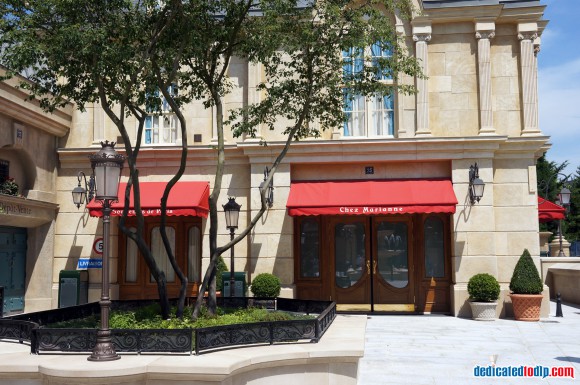
With all the fanfare that came with the opening of the new Ratatouille attraction in the Walt Disney Studios last month you could be forgiven for thinking that the doors were swinging open to more than just a restaurant and a single ride (although it is a show-stopping one). A fully-fledged mini-land was promised and over the next few months that is what we will get when Chez Marianne (Souvenirs de Paris) opens on the Place de Rémy. The new boutique will be the first standalone themed shop to hit the WDS and its design has been a closely-guarded secret until now.
Dedicated to DLP friend Christian Sylt recently visited the WDS to interview one of the imagineers and got some behind-the-scenes insight into what we can expect to find when the doors to the new shop swing open in the autumn.

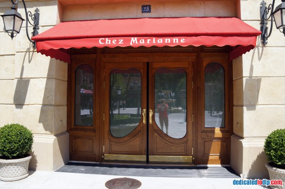
Hanging outside will be a traditional but ornate wooden sign with an oval image atop showing the face of the young French lady who the shop is named after. ‘Chez Marianne’ is emblazoned across the sign in gold lettering and underneath it hangs a small wooden oval which says ‘Souvenirs de Paris’ on it. The traditional style is carried through inside to give the impression of being in an old Parisian shop from the turn of the 19th century.
Curved shapes and flowers will be common features of the decor and all of the technology used in the shop will be hidden from customers’ gazes.
As with all of Disney’s creations, there is a story behind the shop and it has an impact on what will be sold inside. This time the focus of the story is Marianne, the lady whose face features on the sign. So the story says, she is a shop-keeper who bought two boutiques and combined them. It means that the shop will have two areas with different designs. The sweet shop will look rounded and feminine whilst the souvenir shop will have a more angular style.

You may not realise it but Disney frequently designs architectural lines on subliminal themes. For example, in Epcot, its science-themed park in Orlando the designs of the pathways of its east section are angular due to the attractions in the pavilions having a focus on the physical sciences. Test Track is about automotion whilst the themes of Universe of Energy and Mission:Space are obvious. In contrast, you find curved paths and lots of water features in the west section of the park due to its focus on free-thinking and nature through attractions like Journey into Imagination, the Seas with Nemo and Friends and Living with the Land.
Practical considerations have to come into play too and in Chez Marianne the corners of units will be rounded off to avoid children injuring their heads. Like the ride next door, the shop will clearly be an attraction for all the family.
Read Christian’s latest article in The Telegraph; Jobs bonanza: Thousands of staff hired to build new Euro Disney ride
I for one can’t wait to see what this boutique has in store, and combining two different styles into one sounds like a very inventive idea and a great use of space. It should appeal to be almost everyone, as long as the merchandise inside is not just a repetition of what we can see elsewhere. If any shop screamed exclusive merchandise it’s Chez Marianne.


