Disneyland Paris World of Disney Store Concept Art

You’ve probably seen these pictures floating around the internet over the past few weeks – they come from a presentation that Disneyland Paris gave to some select Disneyland Paris fans last month. They were kind enough to send the presentation to a few websites, including this one. We are not permitted to publish the presentation in its entirety, which is understandable, so I have selected a few slides to publish and talk about.

The detail that they go into at this planning stage is so intricate and to mere fans like us, incredibly fascinating. Click on the picture to enlarge it and look at the detail of the wall murals and even the merchandise on display – I can spot Mickey Mouse and Winnie the Pooh plushes, what can you see?
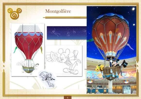
The hot air balloon is the central feature of the World of Disney Store, which you can see here in it’s concept art stage. You can see the photo of the real thing to the right and they actually stayed very close to the design, with a few extra touches added. This is just one of the many features within World of Disney which make it more than a store, and an attraction in its own right.
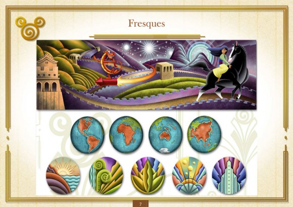
This slide shows one of the amazing murals that adorn the walls and various shots of the globe show that different murals will feature different parts of the world, as represented in the films. This Mulan mural is representing China, or maybe even the bigger area of Eastern Asia. There’s no denying that with this kind of decor, World of Disney is going to stand head and shoulders above any other shop on the resort.
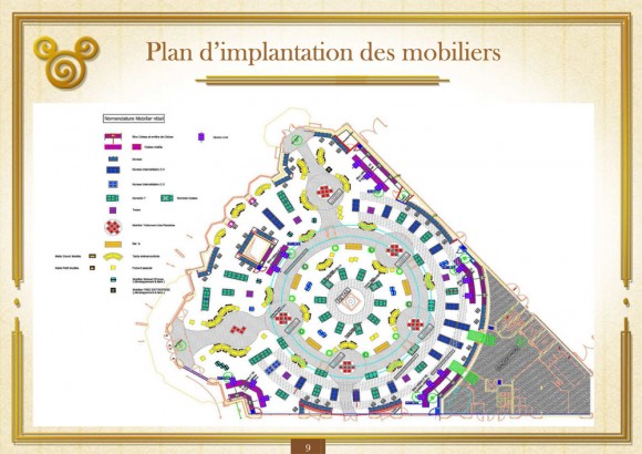
No, this is not an overhead sketch plan of the whole resort, but the floor plan of the World of Disney Store in Disneyland Paris. I know, very complex isn’t it? What’s interesting to see from this is all the doors that give access to the building and I wonder how many of them will be usable by the public. A store this size that faces different parts of the Disney Village area should have public access doors on as many walls as possible, to gain the maximum flow of potential customers.
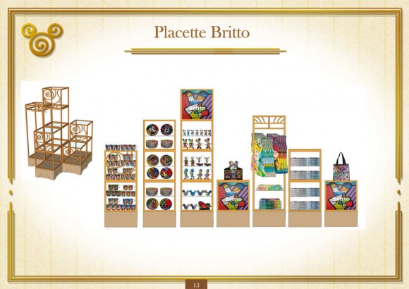
This slide shows the area dedicated to Britto designed or inspired merchandise. Not satisfied with just reserving areas for merchandise ranges, they allocate certain amounts of display space to specific items of merchandise. No detail has been ignored in the panning of this new flagship store. You can find out more about Britto here.

Though rumours of Duffy’s demise have been running rampant over the past few weeks, some of those emanating from this very website, there is quite a lot of space reserved for Mickey’s favourite bear. Look closely and you may see there looks to be a new size of Duffy available – Huge Duffy could be on sale very soon.
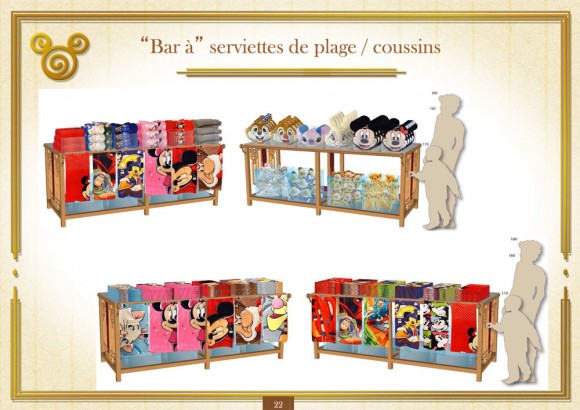
By this point I very much doubt anyone is doubting the sheer extent of the planning that has gone in to World of Disney, but if you are, then took a look at the slide above. They’ve taken what I assume to be the average height of both a child and adult visitor, calculated eye level, and used that information to design both the display units and what array of merchandise is put on them. Yes, I know this is all done to maximise sales, but it’s pretty impressive all the same and it’s not often we get to look this deeply into the process of designing a shop.
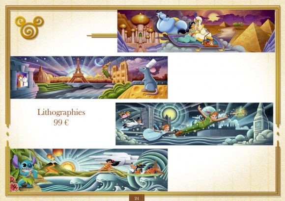
I can’t wait to see what these lithographs look like in real life. 99€ probably seems a lot to spend on a piece of Disneyland Paris merchandise, but these could be pretty big if the 70€ Retro canvas is anything to go by, and the images are fantastic. I love how some combine films and characters, like Goofy with Lilo & Stitch, and Quasimodo, Ratatouille & Aristocats featured in the same lithograph.
Today is the first day that the general public can gain acess to World of Disney, well, as long as you are an annual passholder or Shareholder’s Club member. I am the latter but it just wasn’t possible for me to be there today, unfortunately. The store opens to everyone next Thursday, July 12th. If you are there today, or you visit next week, be sure to let me know what you think, and send me some photos! It does look like an absolutely incredible building, both as a shop and an example of great architecture and design.
